1.

The first TV listings I looked at was from 'TV & Satellite Week', the weekly magazine that gives you details about whats on and where.The main channels are included on the first page of the day - this day is Friday. Each channel has its own separate column, spreading down the page where its seperated into hourly slots after 7pm as this is when TV becomes more popular to watch. To make things easier to read, 8pm and 10pm is shaded in a light blue, so the listings don't get mixed up with 7pm and 9pm.
Below the channels name, they have included the channels TV number for either Sky, Virgin, Freeview or Freesat, very helpful as you're not flicking through channels trying to find it. They also include a column named 'Local Variations'. This is, for example, when the local news is on or perhaps a local program for Wales which wouldn't be shown in Scottland. This is helpful and becomes more specific to certain areas.
Where the magazine layout is concerned, the days are organised by colours along the side of the magazine. Saturday is blue, Sunday is pink, Monday is a teal blue, Tuesday is purple, Wednesday is red, Thuesday is purple and Friday is green. This is a much quicker way to find the day you want, and seperates the days from one-another.
Although a lot of organisation and information is included in this magazine spread, its far to busy for me and it lacks colour and entusiasmn, something I hope to include in my own TV lisiting/magazine spread.
2.
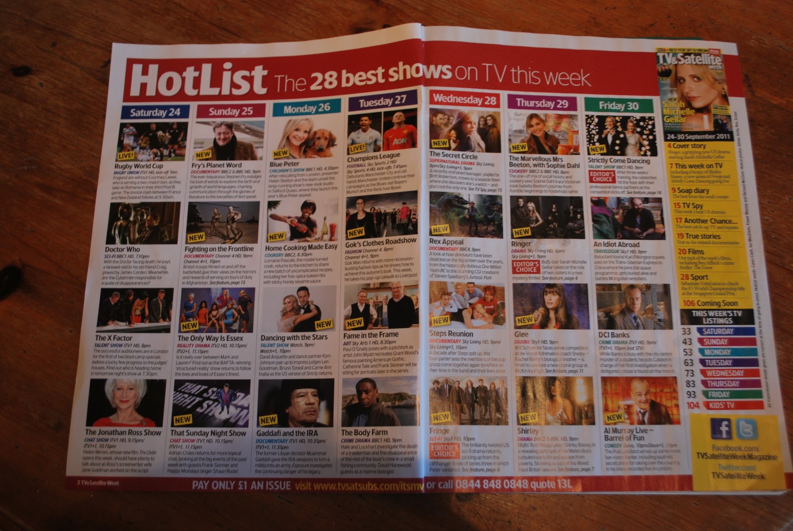
This double-page spread again is from 'TV & Satellite Week', but this time its advertsiting the 28 best shows on TV. Just like the days of the week down the side, the boxes are in matching colours - showing a running theme throughout the magazine creating continuity and familiarity from the readers. The layout is simple, 7 coloums running down the page making it easy to follow. They include pictures of the shows advertised, so the reader is drawn to a certain show if they like the look of the photo, or recognising a familiar face. Below the photos they include the same, TV channel, time and a quick description on the show. They've also included many new shows, showing they support new up-coming TV programmes making them very up to date. I like the layout, the colour scheme, the use of photos and the simplicity of the fonts used.
3.

Lastly, this is from the same magazine but a completely different double-page spread. Where as the other 2 were focused on a variation of channels and TV shows, this is dedicated to the new Strictly Come Dancing shown every Friday on BBC1 at 9pms. On the bottom left they've included a little bit of information about SCD, including lines like "So who's hot to trot, and who's got two left feet" to get viewers to tune in.
They're use of the main header "Ballroom glitz" is really good and effective. It makes the show sound glamourous, especially with the use of bold to empasise 'glitz', people will watch to see the glitzy outfits which will be over the top. To acompany the interessting title, they've included a photo which dominates most of the page, including the stars taking part dressed up in their over the top, glitzy costumes creating an exciting feel as it looks like something you cant miss. Next to the people, they include numbers which you follow to the bottom white box where details and quotes are included. All this information and photos make you feel very into the show before it starts. The layout is clean, the font is easy to read, the colours aren't OTT and the information is very interessting.
Good analysis - in all 3 areas. The double page spread you're going to create is going to be based on your channel launch so doing further analysis pieces on channels or shows such as SCD would be useful in helping you decide what content to include and how.
ReplyDelete